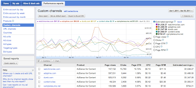
 We understand that many of you analyze how ad units or channels perform compared to each other to help you decide whether you should make changes to improve performance. Now, in the new interface, we provide you a new way to analyze individual items against one another.
The chart feature will allow you to see custom channels or ad units as their own line on the graph, so you can easily identify spikes or dips. To see how your channels perform compared to each other, visit the Performance Reports tab, and click Custom channels. Depending on the number of channels you're using, you might be asked to filter the list and then click Update report. Once your selected channels are listed below the graph, you'll see the Combine and Chart buttons.
Select a few channels and hit 'Chart.' Now you can see each specific channel in it's own color on the graph. You can use the buttons next to the graph to change the metric for which you're comparing the channels. Using this feature, you might notice that discrepancies between channel performance are more obvious on the graph than they are just viewing the numbers in the table.

Try it now! Navigate to the Performance reports tab, and select any report for which you want to chart items.
Help us figure out what you need and want in your reports by sending your feedback through the 'Report issue' link in the upper corner of your account or joining the conversations in our forum.
--
Posted By Inside AdSense Team to Inside AdSense at 5/04/2011 08:00:00 AM --
Unable to view the links or images in the message above? Want to comment on this post? Visit http://adsense.blogspot.com/ .
You received this message because you are subscribed to the Google Groups "Inside AdSense" group.
To unsubscribe from this group, send email to Inside-AdSense-unsubscribe@googlegroups.com
For more options, visit this group at http://groups.google.com/group/Inside-AdSense


 8:00 AM

0 comments:
Post a Comment